# HTML+CSS 实现翻页漫画书
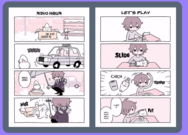
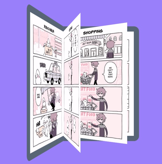
# 实现效果
# 实现代码
<!DOCTYPE html> | |
<html lang="en"> | |
<head> | |
<meta charset="UTF-8"> | |
<meta http-equiv="X-UA-Compatible" content="IE=edge"> | |
<meta name="viewport" content="width=device-width, initial-scale=1.0"> | |
<title>翻页漫画</title> | |
<style> | |
body { | |
background-color: #9980FA; | |
display: flex; | |
justify-content: center; | |
} | |
.a { | |
width: 270px; | |
height: 420px; | |
position: absolute; | |
top: 150px; | |
transform-style: preserve-3d; | |
perspective: 1000px; | |
transition: .8s; | |
} | |
.b, | |
.c, | |
.d, | |
.e, | |
.f { | |
width: 270px; | |
height: 400px; | |
position: absolute; | |
/* 这是翻页的起点,在左边 */ | |
transform-origin: left; | |
background-size: cover; | |
/* 这是翻页时元素之间的延迟 */ | |
transition: calc(var(--i)*.3s); | |
/* 这是翻页时元素的层级 */ | |
z-index: calc(var(--i)*99); | |
} | |
.b, | |
.c { | |
border: solid 20px #576574; | |
border-left: none; | |
top: -20px; | |
border-radius: 0 20px 20px 0; | |
} | |
.a:hover .b { | |
border-left: #576574 20px solid; | |
} | |
.a:hover .c, | |
.a:hover .d, | |
.a:hover .e, | |
.a:hover .f { | |
transform: rotateY(-180deg); | |
/* 此时翻页的顺序会倒过来,所以我们的延迟和层级也要反一下 */ | |
transition: calc(var(--s)*.4s); | |
z-index: calc(var(--s)*-99); | |
} | |
.a:hover { | |
transform: translateX(100px); | |
} | |
</style> | |
</head> | |
<body> | |
<div class="a"> | |
<div class="b" style="--i:2;background-image: url(fymh/1.gif);"></div> | |
<div class="c" style="--i:4;--s:1; background-image: url(fymh/2.gif);"></div> | |
<div class="d" style="--i:3;--s:2; background-image: url(fymh/3.gif);"></div> | |
<div class="e" style="--i:2;--s:3; background-image: url(fymh/4.gif);"></div> | |
<div class="f" style="--i:1;--s:4; background-image: url(fymh/5.gif);"></div> | |
</div> | |
<!-- <div>A Boy and Cat</div> --> | |
</body> | |
</html> |
# 画外音
有时粘贴本地图片使用本地相对地址因为某种不明原因无法显示出来,如博文最开头的效果图,此处采用图片的 https 地址。